Objective:
- Differentiate between raster and vector graphics, understanding their advantages and appropriate use cases.
- Grasp essential color theory concepts, including RGB, CMYK, color spaces, and models, and their significance in design.
- Learn about resolution and image quality, including DPI and PPI, and their impacts on print and digital media.
Fundamentals of Graphics
Raster and vector graphics are two fundamental concepts in digital design. Understanding the differences between them is crucial for creating effective designs and choosing the right tools for various projects.
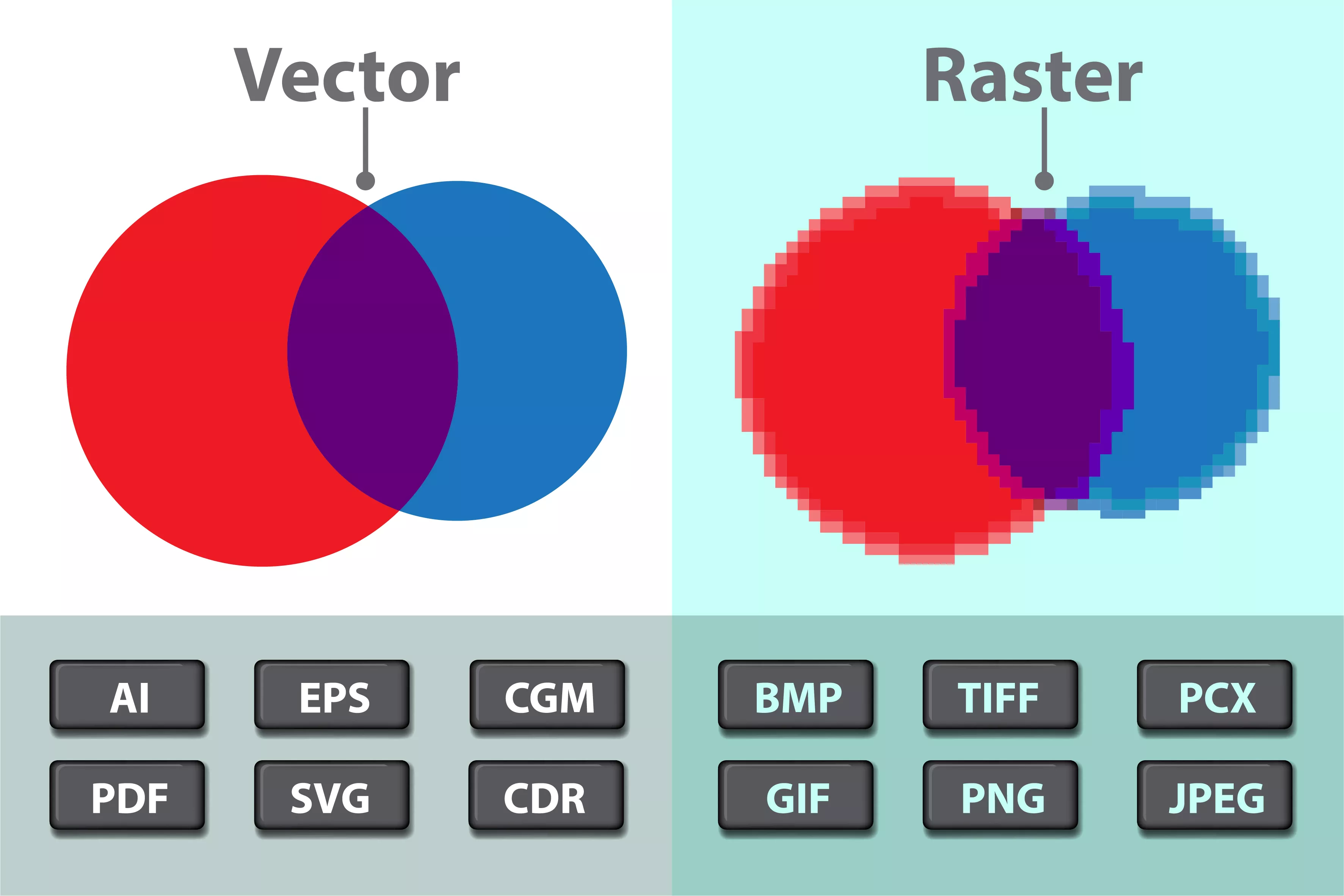
Raster graphics, also known as bitmap graphics, are made up of pixels arranged in a grid. Each pixel can have a different color and shade, allowing for detailed and realistic images. However, as the image size increases, the number of pixels also increases, which can lead to a loss of image quality. Raster graphics are commonly used in digital photography, painting, and other applications where detailed images are required.

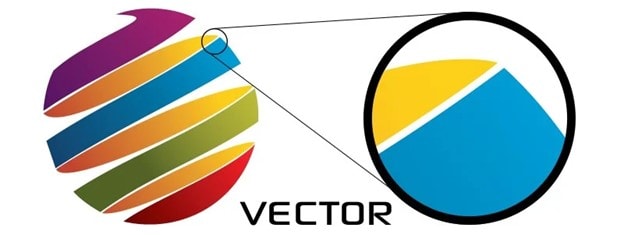
Vector graphics, on the other hand, are created using mathematical equations to draw lines, curves, and shapes. They are resolution-independent, meaning that they can be scaled up or down without losing image quality. Vector graphics are commonly used in logos, illustrations, and other designs where scalability is important.
Raster vs. Vector Graphics
Differences:
Raster Graphics: Made up of pixels; resolution-dependent; common formats include JPEG, PNG, GIF.
Vector Graphics: Composed of paths defined by mathematical expressions; resolution-independent; common formats include SVG, EPS.
Advantages and Use Cases:
The table below summarizes the difference between Raster and Vector Graphics:
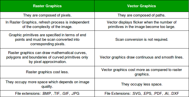
Raster Graphics:
Advantages
- High-quality images: Raster images can display rich, complex color blends and detailed textures, making them ideal for digital photos and print materials.
- Easy editing: Raster images can be edited using software like Adobe Photoshop, which allows for detailed manipulation of pixels.
Disadvantages
- Resolution limitations: Raster images are limited by their resolution, which can lead to pixelation when scaled up.
- Large file sizes: Raster images typically have larger file sizes due to the number of pixels required to create the image.
Use Cases
- Digital photos: Raster images are best suited for digital photos, as they can display detailed textures and colors.
- Print materials: Raster images are ideal for print materials like business cards, brochures, and posters, where high-quality images are necessary
Vector Graphics:
Advantages
- Scalability: Vector graphics can be scaled up or down without losing quality, making them ideal for logos, illustrations, and other designs that need to be used in various sizes.
- Small file sizes: Vector graphics typically have smaller file sizes due to the mathematical formulas used to define the paths.
Disadvantages
- Limited color blending: Vector graphics are not as effective for complex color blending and detailed textures, as they are based on solid shapes and lines.
- Less detailed editing: Vector graphics are less suitable for detailed editing, as they are based on mathematical formulas rather than pixels.
Use Cases
- Logos and illustrations: Vector graphics are ideal for logos, illustrations, and other designs that need to be used in various sizes and resolutions.
- Digital printing: Vector graphics are suitable for digital printing applications like business cards, billboards, and other materials that require scalable designs
Objective:
- Identify and apply the elements of design, such as line, shape, color, texture, space, and form.
- Understand and utilize the principles of design, including balance, contrast, emphasis, movement, pattern, rhythm, and unity.
- Gain a foundational understanding of typography, including font types, sizes, spacing, and alignment.
Graphic Design Principles
Elements of Design
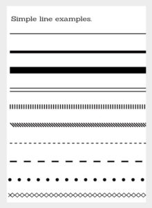
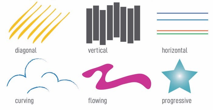
Line: A continuous mark that can define shapes, create textures, and lead the eye in a direction. Lines can be straight, curved, thick, thin, solid, or dashed.
Shape: An enclosed area defined by lines or contrast in color or texture. Shapes can be geometric (circles, squares) or organic (natural, free-form).

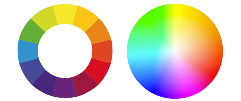
Color: An essential element that creates mood, establishes emphasis, and conveys emotions. Understanding color theory and the color wheel is crucial for effective design.
Texture: The perceived surface quality of an object. Texture can be visual (illusion of texture in a design) or tactile (actual texture in a physical product).

Space: The area around, between, and within objects. Positive space refers to the main subjects, while negative space (or white space) is the empty area around them.
Form: A three-dimensional object with volume and thickness. Form can be viewed from different angles and includes both geometric and organic forms.

Principles of Design
.png)
Balance: The distribution of visual weight in a design. Balance can be symmetrical (equal distribution) or asymmetrical (unequal but still balanced).

Contrast: The difference between elements that makes them stand out. Contrast can be achieved with colors, shapes, sizes, and textures.
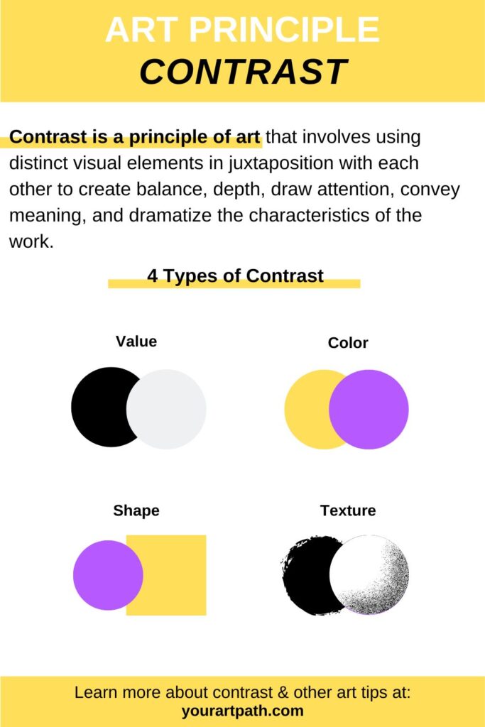
Emphasis: The focal point of a design that draws the viewer’s attention. This can be created through contrast, placement, and size.
Movement: The path the viewer’s eye follows through a design. Movement can be directed along lines, edges, shapes, and colors within the composition.
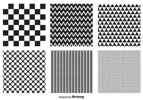
Pattern: The repetition of elements in a predictable manner. Patterns create rhythm and can be used to decorate surfaces.
Rhythm: A sense of organized movement created by the repetition of elements. Rhythm can be regular, flowing, progressive, or random.
Unity: The harmonious arrangement of elements in a design, creating a sense of completeness. Unity is achieved when all elements work together cohesively.
Typography
Font Types:
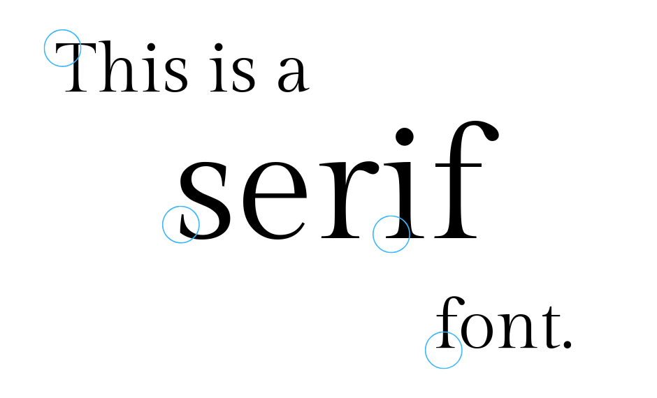
- Serif: Fonts with small lines at the ends of characters (e.g., Times New Roman). Often used for traditional and formal designs.
- Sans-Serif: Fonts without serifs (e.g., Arial). Commonly used for modern and clean designs.

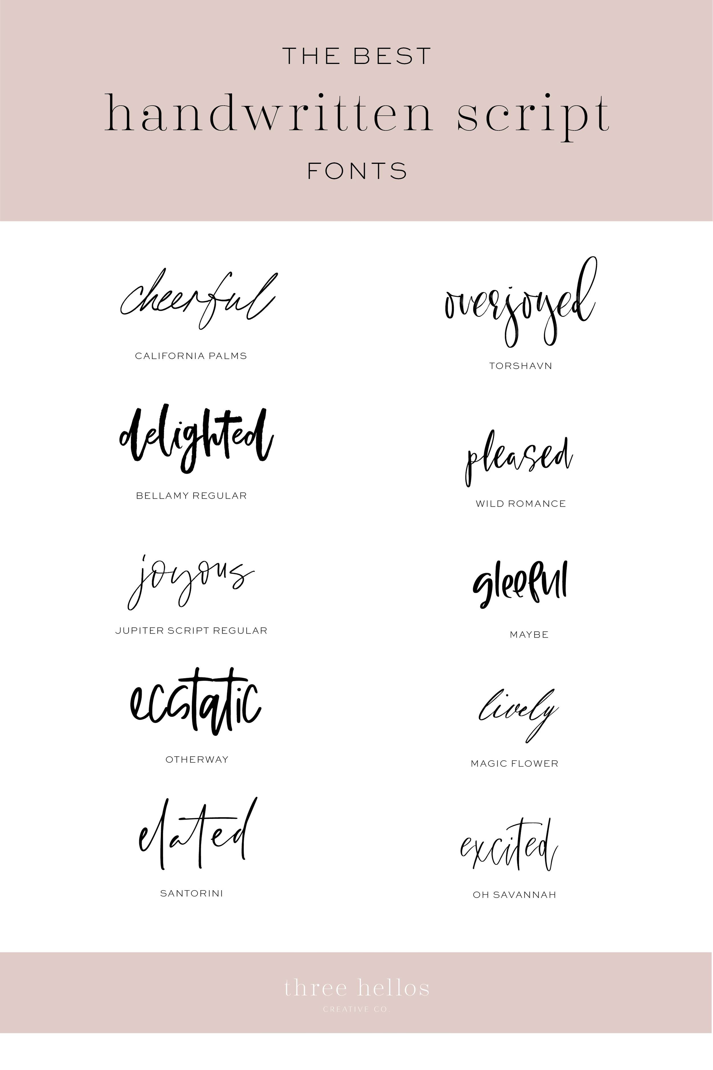
- Script: Fonts that mimic cursive handwriting (e.g., Brush Script). Used for decorative and elegant designs.
- Display: Unique and decorative fonts used for headings and impactful text (e.g., Comic Sans).

Sizes:
- The size of text is measured in points (pt). Headlines are usually larger to attract attention, while body text is smaller for readability.

Spacing:
- Kerning: The adjustment of space between individual characters.

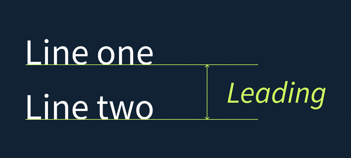
- Leading: The vertical space between lines of text.
- Tracking: The overall spacing between characters in a block of text.
![]()
Alignment:
- Text can be aligned left, right, center, or justified. Proper alignment enhances readability and aesthetic appeal.
